Clear, timely and actionable
information for both,
patients and providers
- UX Research
- UX / UI Design
- Interaction Design
- Visual Design
- User Test
- Prototype
This new molecular diagnostic platform will enable precision medicine testing to be run anywhere with maximal quality and efficiency. For patients and providers, this means access to clear, timely, actionable information. For labs with innovative tests, this means enabling their test to be run close to the patient, where it is most impactful.
Sector: Healthcare
Client: Bioceryx
Platform: Control Panel SW / Cloud-based
An optimized interface that makes the user feel in control
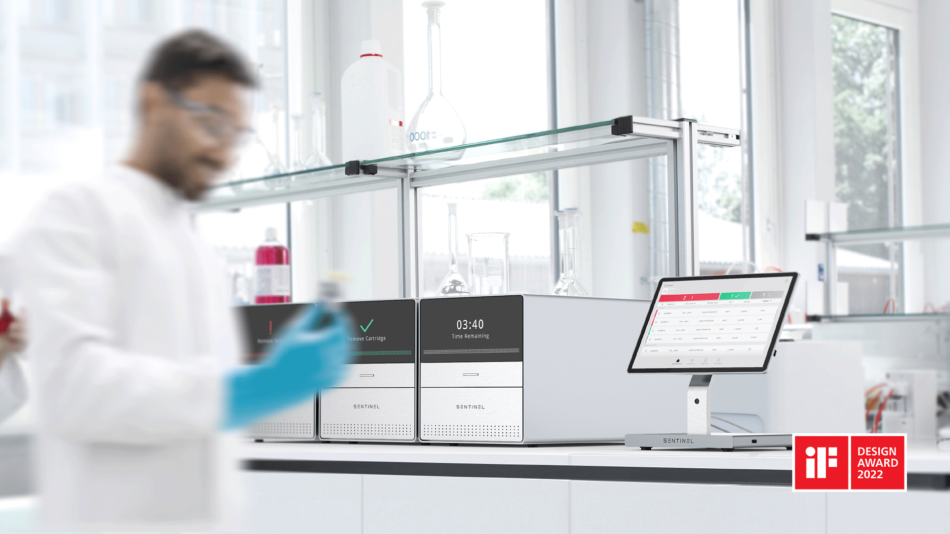
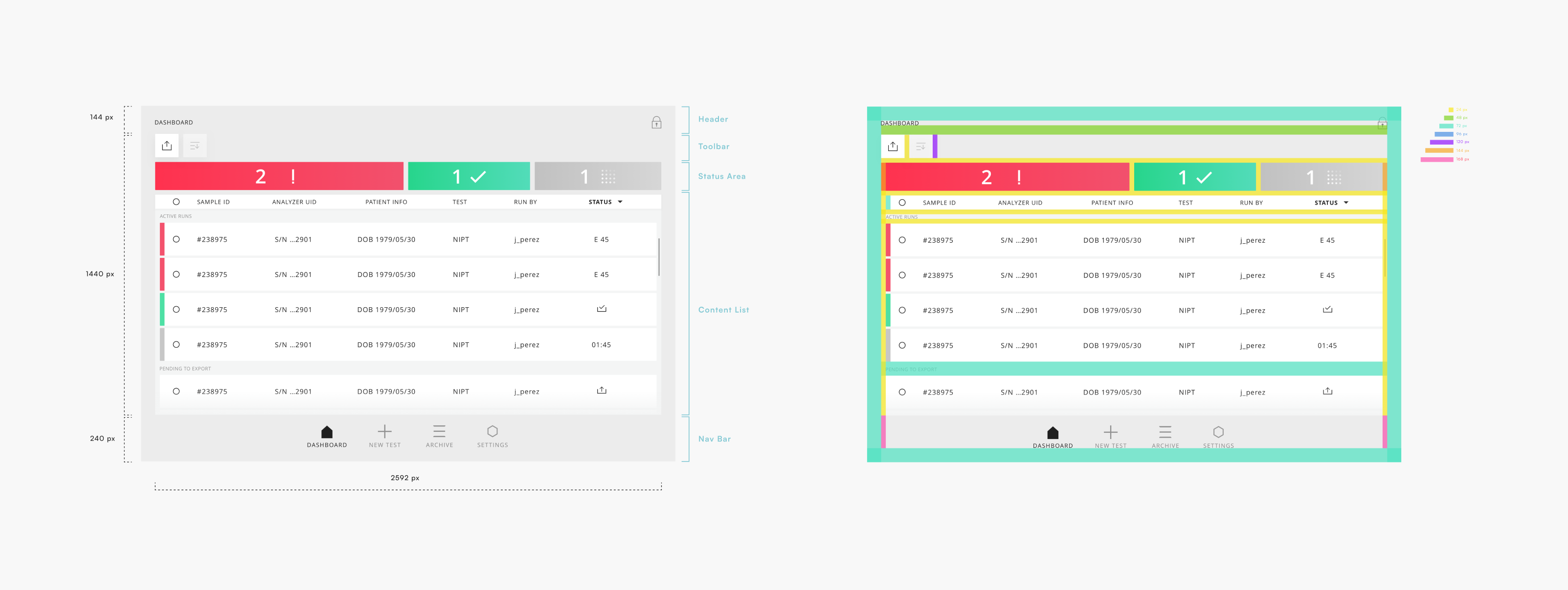
Sentinel has two interfaces that makes users feel lighter and in control, one of the analyzers that shows in a simple way what’s going on the system and how much time is left for the run to end. Secondly the Controller, a control panel software where all analyzers statuses are shown and users can visualize and browse all the test results performed in the Sentinel system.
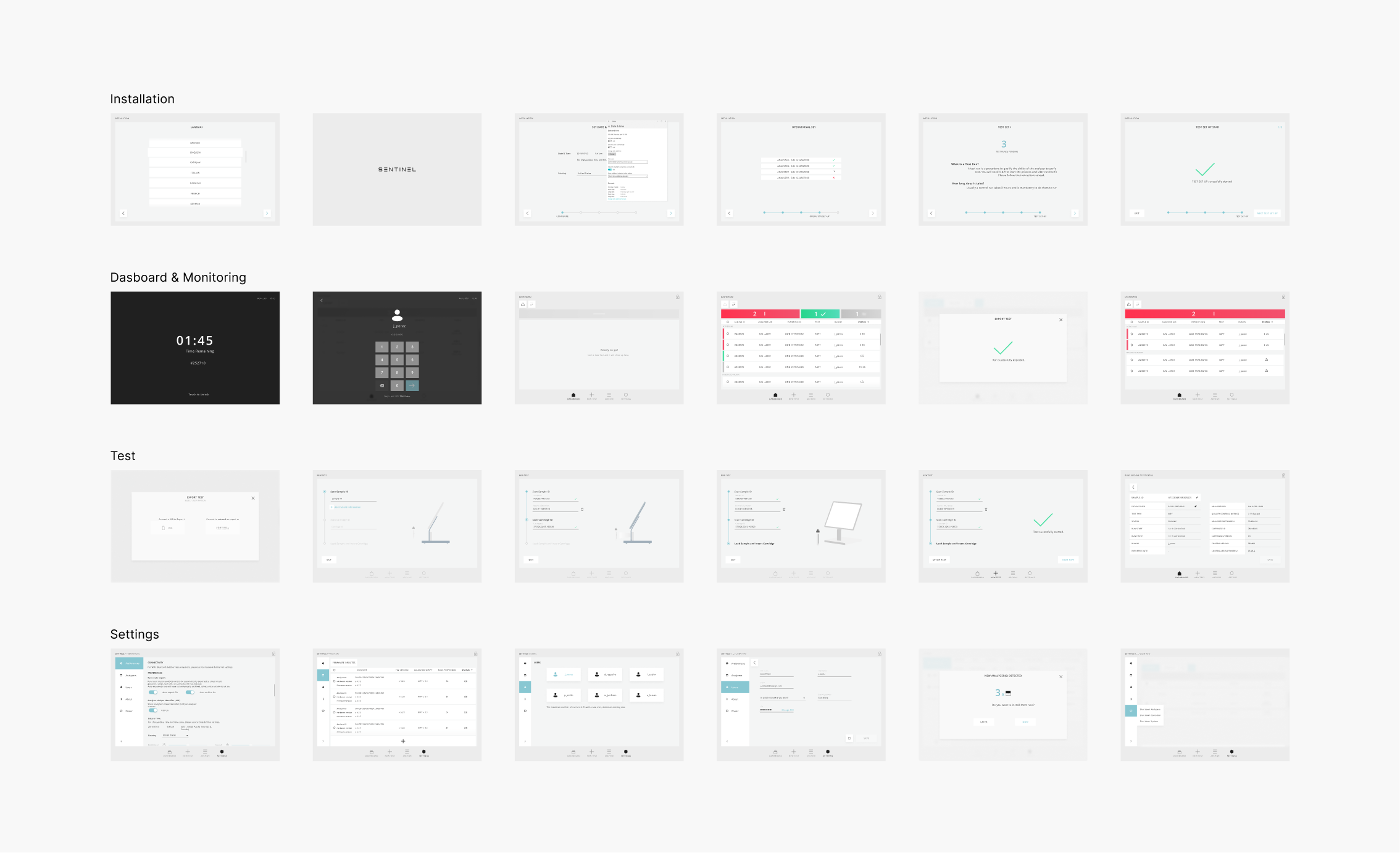
After fieldwork in laboratories around the world, the main workflow of launching a new NIPT Test could be redefined and optimized to improve the user experience.


A system that grows and adapts to different scenarios.
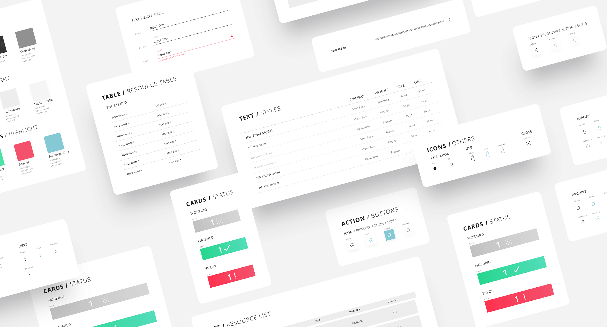
Following a style that shows precision and professionalism, we created The Sentinel Design System which provides all the components and foundations that apply to any Sentinel Digital Product.
Once the design phase was completed, and before implementing the software, user tests were carried out in various laboratories throughout Europe were key project issues were validated, such as the interaction between the controller and the analyzer, the main workflows of the software and the accessibility and visuals of the user interface. Achieving the main goal of creating a system that grows and adapts to different scenarios of use and provides harmonious experience for users making precision medicine accessible for everyone.